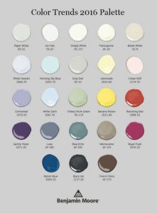
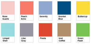
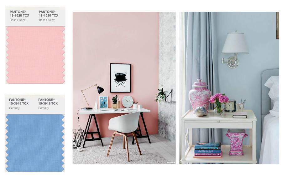
2022 Colors of the Year

If  the colors of spring have inspired you to update the colors in your home, you’ll find plenty of inspiration within the 2022 Color of the Year palettes.
Benjamin Moore chose October Mist as their Color of the Year – a silvery green based on something we see everywhere, but often overlook – a flower stem. This neutral green provides the perfect base to complement their carefully curated collection, and is sure to breathe new life into any space in your home. Our favorites include Collector’s Item, Wild Flower, and Mysterious.

Sherwin Williams also selected a neutral green as their Color of the Year, but one with a slightly deeper tone and feel. Evergreen Fog, a “chameleon” like gray-green has a very earthy and organic feel, perfect for creating a calm and relaxing space.

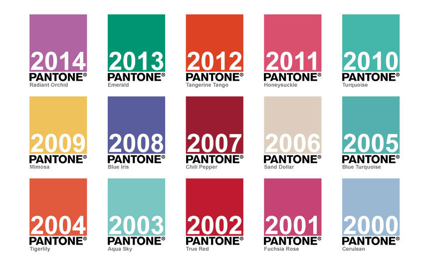
And while the Pantone Color of the Year may not always make it into the mainstream in interior home remodeling, it’s always fun to see what’s trending in color and design throughout other industries. This year’s Color of the Year, Veri Peri, is sure liven things up. Just a small splash of a fun color is all it takes to change the look and feel of a space, and shift your mood as well.

If you’ve grown tired of gray and are ready to add some color back into your life and home, our color experts are ready to help you select colors with confidence that are a true reflection of your own personal style.


2021 Colors of the Year

Whether you’re in need of a breath of fresh air or some solid ground underneath your feet as we enter into a New Year, the 2021 colors offer something for everyone to set the perfect tone for a fresh start.
Benjamin Moore
Aegean Teal 2136-40
This mid-tone blue-green with cool gray undertones sets the perfect backdrop for a balanced and welcoming feel in any room. Utilizing the theme of “your home is your refuge”, Benjamin Moore created a warm, sun-baked color palette that is both intriguing and comforting and includes some bold colors along with some classic neutrals.


Sherwin Williams
Urbane Bronze SW-7048
Pulled straight from mother earth, this grounding neutral creates a sense of peace and tranquility and allows lighter complimentary colors to truly shine through.

 
Pantone
Illuminating & Ultimate Gray
Once again, and at the close of a tough year, Pantone decided one color of the year wasn’t quite enough. Combining a practical gray and optimistic yellow, these two colors blend seamlessly together to create a sense of security with a much needed touch of hopefulness for the future.


When it comes to color, what we see everyday has a direct impact on how we feel. From calming blues, stimulating reds, cheerful yellows to natural greens that bring the outdoors inside, be sure to choose colors that suit your personality and style. From classic to on trend, bold and bright, or soft and subtle, whatever you seek to create can be accomplished with just the right shade of paint.


Benjamin Moore – 2020 Color Trends

 
It’s the start of a New Year (and decade), and that means time for a fresh color palette. In researching the final selection for 2020, Benjamin Moore took a look back at the color trends over the past 100 years before deciding upon the colors that will carry us into the future.
As the social climate ebbed and flowed over the decades, so did the colors that were used throughout our homes. Remember the bold and saturated colors from the 60’s and 70’s? Or the more muted and conservative tones as we approached the new millennium that hung around for the better part of the decade? As we enter into 2020 and another new decade, many of us are considering “what’s next?” with the fresh new start. The Color of the Year – First Light – infuses an air of optimism and possibility into an untouched future.
Benjamin Moore First Light is a “rosy” hue and modern neutral that will brighten any room in your home.  It also pairs well with the many grays that have been used on the interior of homes for the past few years. And according to Linda Cipriano, Benjamin Moore’s Architectural & Design Expert, “everyone looks good in pink.” With a slow shift from cool to warmer tones, the coordinating palette offers possibilities for all tastes and styles.

 
If you’re ready to move away from the grays and infuse some color back into your home, download our checklist on how to choose colors with confidence. And if you’d like a second opinion before updating a room in your home, our color consultant would be happy to sit down with you and help you create the home of your dreams.
Choosing Colors Checklist


Choose Color – From Fearful to Fantastic

“Color can convey meaning, often more effectively than words.”
– Zena O’Connor
The foundation of all design is color – and yet it’s something that makes many of us extremely nervous. Especially when we start considering what colors to bring into our homes when repainting.
We often fear choosing the “wrong” color and having it turn into a time consuming and costly mistake to fix.
And we opt for the “safe choice” – the neutrals or varying tones of gray, white, and beige as our design backdrop.

We convince ourselves that we might tire of a “real” color too quickly, we can live with the neutrals longer, and we won’t have to worry about money wasted on a poor choice. We then further justify this reasoning by telling ourselves we can use pops of color as accents to liven things up. However, this is not the same as choosing a true color for your walls or even your ceiling.
Not fully convinced?
Think back to the last time you walked into a room painted with color… Whether bold or subtle, color creates an entirely different energy than a neutral backdrop ever can. Extensive research shows that color can make you feel energized or calm, powerful or peaceful, cheerful or cozy, and most importantly – welcome. Color adds dimension and character to a home. It can convey your style to the world and tell your story without you needing to utter a single word.
If you have a space in your home that you think would be enhanced by color, you don’t have to make the decision alone. Our color consultant has an M.A. in Interior Architecture and Design and will collaborate with you to choose colors that will fill your heart and home with joy and confidence.

Color consulting is a complementary service provided with any project you wish to complete with us. We pride ourselves not only on our exceptional craftsmanship and communication throughout each project, but also on the extra care we take with our customers to make sure they’re confident with their final color choices.
 
Photo Credit: Benjamin Moore Paints


2016 Color Trends & Finding Your Signature Palette

2016 Color Trends: While we report on the Color Trends every year, they are just that – trends. When it comes to updating the colors in your home, incorporating current colors can be fun, but figuring out your signature style and using your favorite colors throughout your home is often a better way to go.
This year we shared the “2016 Color of the Year” from the top three companies in the painting industry. Pantone (the world leader in all things color) stepped out of the box by selecting not one, but two 2016 Colors of the Year – Rose Quartz and Serenity. If you’re not a fan of pastels, the lesson to be taken from this selection is that traditionally “warm” colors can be paired with “cool” colors and coordinate beautifully.

 
Sherwin Williams also took a different approach to 2016 color trends this year, opting to create “Color Stories” in place of choosing one particular color. Using the terms passionate, fresh, vintage, and indulgent as their starting point, they have created four color palettes that are sure to speak to both the bold and adventurous as well as more traditional homeowners.

 
Benjamin Moore also chose to go in yet a different direction, and while they did select a single 2016 Color of the Year – Simply White – some question whether this was truly a “color” selection at all. Whether or not you believe that white is a color, what they have done is sparked the idea of starting with a blank canvas. Freshening up any space with a base coat of this creamy white is almost like hitting the reset button in your home. With a clean backdrop, it is much easier to re-imagine what other colors you would like to incorporate into your home, and they have provided some beautiful accent colors in their full color report to assist with this as well.

 
Ultimately, the best place to start when considering a new color palette for your home is with an open mind. Look around when you’re out and about and take note of the colors that catch your eye. Or if you’ve been saying “I’ve always wanted to paint the [ fill in the blank]…” maybe now is the time to go for it. Believe it or not, of all the things that you could “change” in your home, the color on your walls is one of the easiest, but also most impactful. And when you’re ready, our color experts are always here to help you make your final choice with complete confidence.


The Story Behind “Simply White” – Benjamin Moore’s 2016 Color of the Year

2016 Color of the Year Backstory: Last week we hosted a designer luncheon along with Benjamin Moore to discuss color (of course) and the current trends in the painting industry.  While some may think that “Simply White” was not truly a “color”, after hearing the story of how Benjamin Moore’s research team arrived on this choice, we all walked away with a deeper knowledge of how the color trends emerge each year.
After traveling the world observing trends and looking for patterns, the new Louis Vuitton Foundation building in Paris left the biggest impression on the Benjamin Moore team. Being compared to a ship with billowing sails, the light and airy feel of the space led them to consider white for 2016, but with over 250 whites in the Benjamin Moore collection, deciding which white was the “right” white was still a difficult task. Staying in the mindset of the artistic world, and drawing from the Frank Gehry design, they imagined the life of various artists and set out to create the perfect backdrop for a traditional painter as well as a digital designer, and all of those who fall in between.


One of the keys to successfully using white to create a backdrop is to vary the tones and sheens of the paint. Pairing Simply White with Ballet White or Mascarpone creates subtle variations in color while leaving an overall freshness in any space. Using a high gloss finish on trim along with a matte finish on wall can also break up what could otherwise become too monotone when using one white throughout an entire space. Simply White also creates the perfect backdrop for more bold colors such as Black Ink, Patriot Blue, and Ravishing Red. The more we learned about white, the more we all realized that “white is not just white”, and the final conclusion of the Benjamin Moore color team was that white truly is an essential color in all decorating palettes. Whether your goal is to create a completely neutral backdrop or infuse a pop of color into a room in your home, choosing the right white to achieve your goal is just as important as choosing any other color. Here’s to white finally getting the credit it deserves as an integral color in home decorating.


The Colors of Spring

Spring is finally here and the flowers are all starting to bloom. As mother nature begins to awaken from winter and spread color across the earth, why not join in the fun? Here are the top 2016 spring colors. You can expect to see them in clothing and accessories before they make there way into home accents. And with Benjamin Moore’s selection on Simply White as their color of the year, these fun colors are a great way to brighten up a neutral space without making a huge commitment. Happy Spring!!


2017 Color Trends – A Sneak Peek at 2017

As we gear up for the final quarter of 2016, Pantone has already begun to gather information for their 2017 Color Trends. Here are a few predictions on what they expect to see in the coming year.
With consumers looking to spend their money on “experiences” and not just “stuff”, the design world now finds itself at a crossroads. Homeowners are still looking to add fresh new colors and furnishings to their homes, but they are seeking a comfortable and “known” look and feel in the process. So how will this translate into the home design trends for 2017?
You can expect to see lots of black and white in home decor, as well as bold colors in interesting patterns. Mother nature is also a driving force in home color trends, with green still at the forefront, and a resurgence of floral as well as jungle prints will make their way into the marketplace.
With the current focus on sleep, thanks to Arianna Huffington’s latest book, The Sleep Revolution, many homeowners are turning their bedrooms back into true sanctuaries for rest, complete with calming color palettes. Deep colors are becoming a more popular choice, with Navy as the standout color so far.

We can also expect to see the incorporation of more mixed metallics in the coming year thanks to the growing popularity of rose gold, although pastels will carry through into 2017 as well with the current prediction of pink as the front runner.
Be sure to check back in the fall for the official Pantone 2017 Color of the Year announcement.


Pantone Color of the Year 2016

After a much longer wait than usual, Pantone finally announced the 2016 Color of the Year, and to everyone’s surprise, they chose two colors for 2016. Rose Quartz, a soft pink and Serenity, a cool blue. Both colors are quite a deviation from the rich and bold colors of previous years, but reflect the need for peace and tranquility in these turbulent times. While Rose Quartz has warm undertones and Serenity cool ones, they both accomplish the same goal by evoking a sense of calm. And when paired together they create a yin and yang affect, balancing each other out perfectly. Look to see these colors popping up in spring fashions and home accent pieces in the months ahead.


Fourteen Years of Color Trends

We’re all anxiously awaiting the announcement of Pantone’s 2016 Color of the Year, but in the meantime here’s a look back over the Pantone color trends for the past fourteen years. Last year’s choice of “Marsala” was an unexpected change of direction for 2015, and we can’t wait to see what 2016 will bring. Do you have a guess? Share it with us as we countdown to the big reveal.


Quality Matters. Call Now for an Estimate 610-664-5555

Home Exterior Checklist

Download our FREE maintenance recommendations to keep your home in top condition.
Download Now
close-link