Sherwin Williams – Color Forecast 2016

While there is no single color from Sherwin Williams for 2016 (at least not yet), they have opted to step outside of the box and produce a fun and whimsical approach to this year’s Sherwin Williams color forecast. With four palettes to choose from, there’s sure to be a color that catches your eye. See the full gallery here and check back soon for more color updates.


Benjamin Moore – Color of the Year 2016

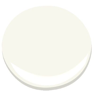
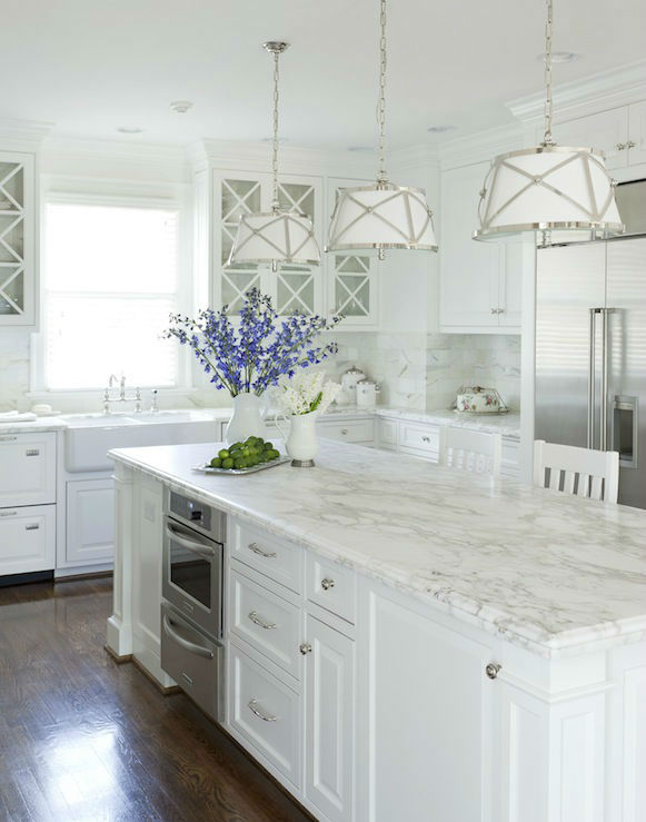
The Benjamin Moore Color of the Year for 2016 is Simply White. While white may seem a strange choice for “Color of the Year”, when paired with a pop of color, natural wood, or in a clean and modern space with bold furniture choices, it can set the perfect backdrop for your room to shine. See the full gallery here and be sure to check back soon for more “Color of the Year” updates.


One of our Favorite “Whites”

If you walk into your local paint store and tell them you want to paint your trim white, they’ll ask you what shade of white. And when they direct you to the wall with all of the color samples, you’ll be amazed to discover how many variations of white there are. Suddenly, what seemed like a simple task just turned into a major decision.
Our goal at John Neill Painting is to make your entire project as smooth and seamless as possible, which includes help from our color experts in choosing the right colors for your space. Over the years, we have developed our own color palette full of classic colors, and one of our favorite whites for trim is Benjamin Moore White Dove. On the more creamy side, White Dove adds the perfect finishing touch to both warm and cool wall colors and is also a great choice when refinishing kitchen cabinets. Want to know what other colors are popular at the moment? Visit our Color Trends page to learn more.


New House, New Paint Colors?

Choosing paint colors for your new house can be a daunting task. We often hear stories like this:
I recently purchased a new home, and now I have the fun task of picking out paint colors for the entire house (it’s all white, and I can’t stand white walls). While this is not a job that I normally struggle with, I’m torn between choosing all new colors or reusing some colors that I love from my current house. What’s a girl to do??
After much debate, I have decided to go with a combination of new and old. My current dining room is a red that I absolutely love, and I will be reusing this color in my new kitchen. My current living room is a warm yellow, and I will be choosing a similar, but more neutral and deeper shade for my new living room and dining room area. And for a change of pace, I’ve selected a bold and vibrant blue for one accent wall in the refinished basement.
While it’s not always easy to step out of our comfort zones, if you have a space that could use a new look and feel, why not try something a little different this time? And be sure to check back in a few weeks for the before and after pictures of the transformations of several spaces.

 
Kitchen Color Palette:
Walls – Benjamin Moore Crimson 1299
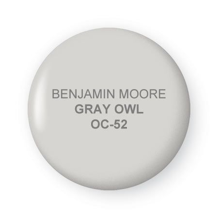
Cabinetry – Benjamin Moore White Dove OC-17
New Backsplash – Subway Tile
Existing Counter Tops – Granite
New Flooring – Cork in an Espresso Finish
Basement Colors:
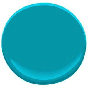
Meridian Blue 761
Palace White 956


2015 Color Trends

Did you know that one of the top reasons homeowners put off painting is due to the fear of choosing the wrong color?
While Pantone is known worldwide as the leading expert on all things color, over the past few years Benjamin Moore and Sherwin Williams have also begun to select and share color palettes with their customers to make choosing colors a less daunting task. Let’s take a look at the 2015 color trends.
While not all of the selections are right for everyone, having a basic idea of what’s popular can be helpful if you do not consider yourself a “color expert.”
Here are the top colors for 2015 from Pantone, Benjamin Moore, and Sherwin William. And our color experts are always a call or a click away if you’re ready to change the look and feel of your home. Here’s to creating your perfect backdrop for 2015.
Pantone – Marsala 18-1438

“This hearty, yet stylish tone is universally appealing and translates easily to fashion, beauty, industrial design, home furnishings and interiors.” – Leatrice Eisman, Executive Director, Pantone Color Institute
Add elegance to any room by incorporating this rich and welcoming hue in accent pieces, accessories and paint. Marsala’s plush characteristics are enhanced when the color is applied to textured surfaces, making it an ideal choice for rugs and upholstered living room furniture.
Benjamin Moore – Guilford Green HC-116
     
“A neutral that’s natural. A silvery green that works with, well, everything. No worries. No second thoughts. Just a brush, dipped in a can, whooshed on a wall, and a whole lot of happily ever after.” –Ellen O’Neill, Creative Director, Benjamin Moore
Ground Yourself in Green – the color that ties things together. This silvery shade of green is the centerpiece of Benjamin Moore’s color trend story for 2015, a palette of 23 shades of green, blue, blush and berry designed to mixed and matched.
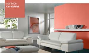
Sherwin Williams – Coral Reef SW 6606
       
“Coral Reef embodies the cheerful approach to design that we’re seeing for the coming year. Its unexpected versatility brings life to a range of design aesthetics, whether traditional or contemporary. This carefree color will liven up a client’s space,” said Jackie Jordan, director of color marketing, Sherwin-Williams.
Perfectly suited to celebrate a mid-decade year that’s poised for revitalization, Coral Reef (SW 6606) is Sherwin-Williams Color of the Year 2015. The uplifting hue is the perfect blend of pink, orange and red that can be used to liven up any space.
Pulled from the Sherwin-Williams Buoyant palette, Coral Reef is influenced by our botanical fixation and optimistic outlook for the future. 


We’re All About Color

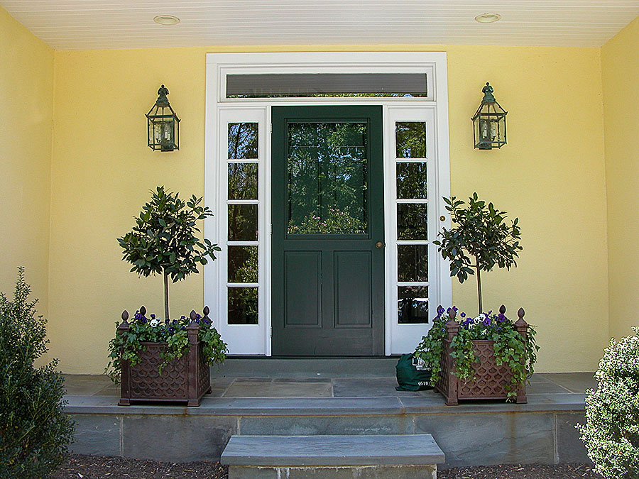
If you haven’t caught on yet, we LOVE color and we’re all about color! And when it comes to your home, changing your paint colors is the quickest way to set a new tone or create a new mood. If you’re thinking about updating an interior room or maybe changing the color of your front door, here are the fall color trends as well as a sneak peek at what you can expect in the spring.


Creating an optimal Workspace – Part II

Part II – Choosing Wall Colors for Your Office with Care
Another crucial decision that’s linked to the light in your workspace is color. Choosing wall colors for your office is a decision you shouldn’t take lightly. If you’re lucky enough to have a wall full of windows and great  light throughout the day, feel free to choose a deeper color for your office walls. If, however the natural light that makes it into your office leaves it feeling like dusk all day long, choose a light color to help boost the energy in your space. With gray becoming the “new beige”, there are a wide variety of neutral shades to choose from that will set an airy backdrop in any room, but especially one with less natural light.


2014 Colors Hit the Home Marketplace

The 2014 color trends have finally hit the furniture industry, and at a much more rapid pace this year. Seems we can’t wait to get ourselves as well as our spaces decked out in these bold and fabulous colors. What fun accessories do you plan to add to your home this spring?
“High Point, the largest and most important furniture and home accessories market in the US, is always a stage for contrasts. The town of High Point, NC is a sleepy (if cultural) enclave that finds itself the unlikely focus of the furniture and home furnishings sector at this biannual market.
This year, we were again impressed by the impact of fashion-driven color themes. The so-called trickle-down effect – that is, the movement of any given color or style from the fashion world to less style-driven businesses – used to take a tentative 18 to 24 months to have an impact.
That time scale is now unquestionably a thing of the past. Today, trends don’t trickle down, they gush out. High Point Market has done an admirable job of detecting the new and the next from fashion markets and selectively translating them to their best possible use in furniture and furnishings. The result: a market that was more energizing than ever for its of-the-moment representation of trend-right color.


Color Made Easy

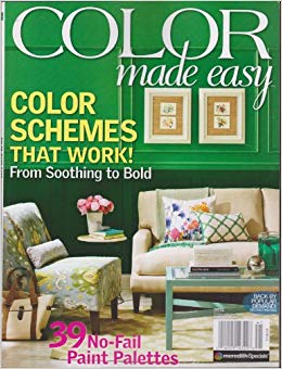
Whether you’re in need of a little inspiration to update the colors in your home, or just like flipping through magazines full of beautiful  interiors, you’ll be happy to know that Color Made Easy is back for the second year. From Color 101 to Tips from the Pros,  the full gamut of colors are explored and explained. Pick up a copy of Color Made Easy at your local newsstand or in the supermarket and get ready to welcome all of the wonderful colors of spring.


2014 Color of the Year

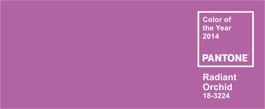
The Pantone official 2014 color of the year is Radiant Orchid. A fresh and invigorating shade, this mix of purple and fuchsia combines the energy of red with the calmness of blue. Radiant Orchid works well with more neutral tones to add that little pop of color. Look to see it popping up in the fashion world this spring and then moving into home accessories.


Quality Matters. Call Now for an Estimate 610-664-5555

Home Exterior Checklist

Download our FREE maintenance recommendations to keep your home in top condition.
Download Now
close-link