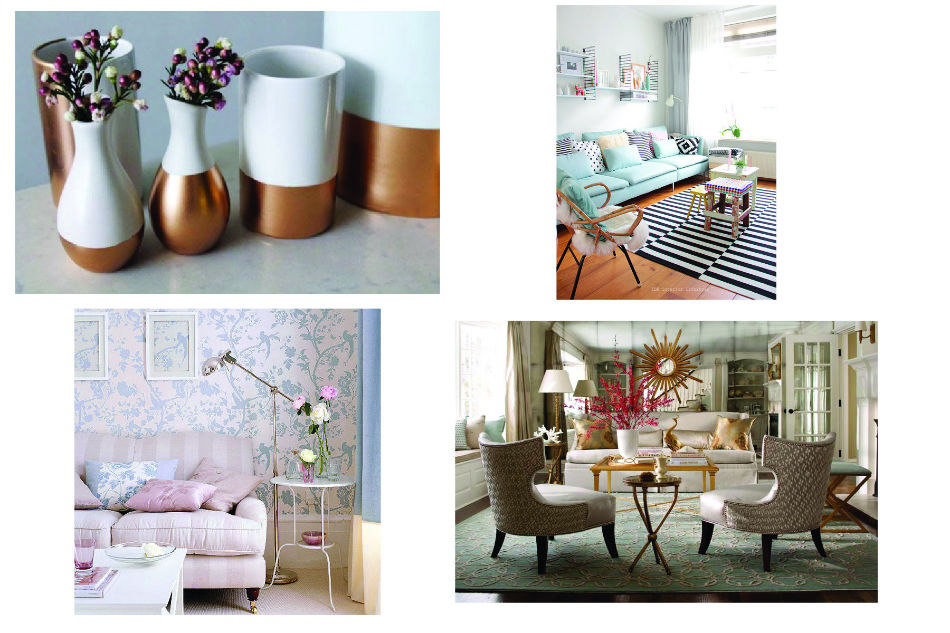
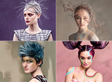
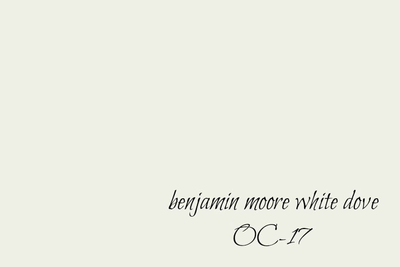
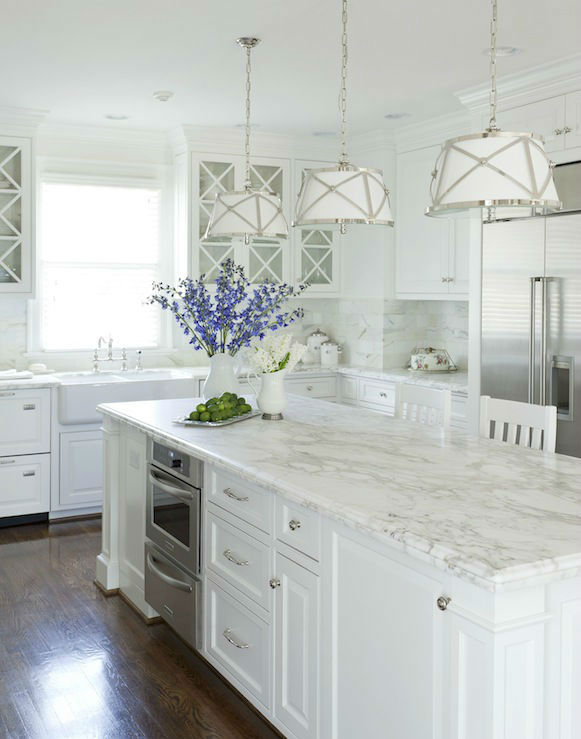
The Colors of Spring

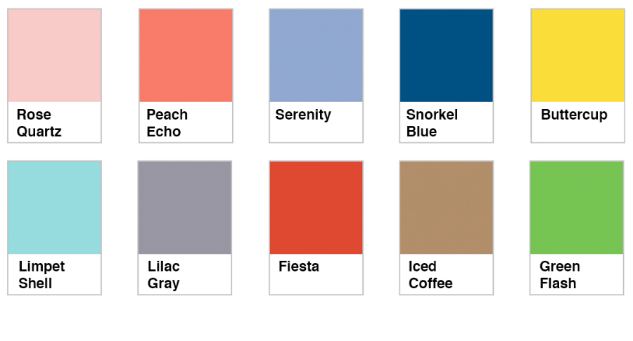
Spring is finally here and the flowers are all starting to bloom. As mother nature begins to awaken from winter and spread color across the earth, why not join in the fun? Here are the top 2016 spring colors. You can expect to see them in clothing and accessories before they make there way into home accents. And with Benjamin Moore’s selection on Simply White as their color of the year, these fun colors are a great way to brighten up a neutral space without making a huge commitment. Happy Spring!!


2017 Color Trends – A Sneak Peek at 2017

As we gear up for the final quarter of 2016, Pantone has already begun to gather information for their 2017 Color Trends. Here are a few predictions on what they expect to see in the coming year.
With consumers looking to spend their money on “experiences” and not just “stuff”, the design world now finds itself at a crossroads. Homeowners are still looking to add fresh new colors and furnishings to their homes, but they are seeking a comfortable and “known” look and feel in the process. So how will this translate into the home design trends for 2017?
You can expect to see lots of black and white in home decor, as well as bold colors in interesting patterns. Mother nature is also a driving force in home color trends, with green still at the forefront, and a resurgence of floral as well as jungle prints will make their way into the marketplace.
With the current focus on sleep, thanks to Arianna Huffington’s latest book, The Sleep Revolution, many homeowners are turning their bedrooms back into true sanctuaries for rest, complete with calming color palettes. Deep colors are becoming a more popular choice, with Navy as the standout color so far.

We can also expect to see the incorporation of more mixed metallics in the coming year thanks to the growing popularity of rose gold, although pastels will carry through into 2017 as well with the current prediction of pink as the front runner.
Be sure to check back in the fall for the official Pantone 2017 Color of the Year announcement.


Sherwin Williams – Color Forecast 2016

While there is no single color from Sherwin Williams for 2016 (at least not yet), they have opted to step outside of the box and produce a fun and whimsical approach to this year’s Sherwin Williams color forecast. With four palettes to choose from, there’s sure to be a color that catches your eye. See the full gallery here and check back soon for more color updates.


One of our Favorite “Whites”

If you walk into your local paint store and tell them you want to paint your trim white, they’ll ask you what shade of white. And when they direct you to the wall with all of the color samples, you’ll be amazed to discover how many variations of white there are. Suddenly, what seemed like a simple task just turned into a major decision.
Our goal at John Neill Painting is to make your entire project as smooth and seamless as possible, which includes help from our color experts in choosing the right colors for your space. Over the years, we have developed our own color palette full of classic colors, and one of our favorite whites for trim is Benjamin Moore White Dove. On the more creamy side, White Dove adds the perfect finishing touch to both warm and cool wall colors and is also a great choice when refinishing kitchen cabinets. Want to know what other colors are popular at the moment? Visit our Color Trends page to learn more.


A Trip To Falling Waters

Our “farewell to summer” vacation a few weeks ago included a trip to Falling Waters, PA in Western Pennsylvania. While it is a bit off the beaten path (nestled in the mountains about 90 minutes from Pittsburgh), it was well worth the drive. Arguably one of Frank Lloyd Wright’s most famous projects, the one hour tour gives you an insight into his thought process in designing and constructing the home down to the very last detail.
Photographs are not permitted within the residence itself, but the technology used (and well ahead of it’s time) allowed for an open floor plan and a minimum number of interior walls. In fitting with his style, the materials and colors used also reflect the surroundings and engage the senses with stunning views and the quiet whir of the waterfall underfoot.
Because our family business revolves around painting, I couldn’t help but spend a few minutes in the small museum on site. The colors Wright selected for both the interior and exterior of the home were considered very carefully and compliment the setting perfectly. They also happen to coincide nicely with the 2014 Fall Color Trends, as we too begin to turn our focus away from technology and back to nature. Be sure to check back next week for the full 2014 Fall Color Report.


The New Neutrals

Like a breath of fresh air, the new neutrals for 2013 are sure to lift your spirits while calming your senses. Light and airy Linen, Tidal Foam, with a gentle earthen feel, and the sleek and sophisticated Alloy all succeed at achieving a sense of calm in a chaotic world. Incorporating these colors into your wardrobe and interior design scheme will be a breeze.


The Colors Of Fall

The leaves have changed colors and there’s a chill in the air, announcing the true onset of fall. If you too are seeking a change of pace along with the changing seasons, here are a few “top picks” for the colors of fall when painting. Whether you’re looking to warm up, cool down, or create a neutral space, color has the strongest impact on our mood and senses. Here’s to setting the tone for the perfect fall.


Quality Matters. Call Now for an Estimate 610-664-5555

Home Exterior Checklist

Download our FREE maintenance recommendations to keep your home in top condition.
Download Now
close-link